About Me

- Tonya
- Hiya I'm Tonya! I'm an avid psper, have been for a few years and finally have me a blog that I've been working on slowly getting stuff added to. I started writing tuts and recently started making masks and templates. I LOVE to see creations you've made with my things, if you'd like to email me please do so at aquaspinner@gmail.com ................................................. My TOU are as follows: All of my items are personal use only NO Commercial Use, please do not share (distribute) my stuff in groups, just send people here to grab please. ♥ Tutorial writers, if you wish to use my stuff in your tutorials, of course I am honored! You're more than welcome to use my stuff in them, I only require that you link to me and send people here to grab the goodies that you are using in the tut. ................................................. Hope you'll enjoy what I have for ya and thanks for stopping by. ♥
Cluster Frame TOU
Thank you SO much for being so interested in my cluster frames. I love that you enjoy using them.
However I do have a request, please do NOT credit me as the cluster frame on your tags. Although I assembled it, I do not believe I deserve any such credit. If anything, please list Scrapkit by, (assuming you didn't add other bit by a different designer to your tag of course). I'd prefer not be given credit for simply assembling the cluster frame. Thank you ♥
Followers
Tuesday, September 7, 2010
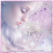
This is the tag we'll be making so, here's what you'll need:
• Tube I used was by Lorenzo DiMauro which I purchased from his site. Please do not use his art without an appropriate license to do so.
• Template I used is by Sexy Ash and you can get it here (template 39) thank you hon for the awesome temp!
• Mask I used was from myself actually lol, you can get them here I used mask 4 & 9.
• I used the scrapkit by the very talented Tamie of Addictive Pleasures called Slave for You and it is available for purchase here. I have used this kit a LOT I just love it lol!
• I used a wordart piece by my dear friend Raq on her new blog for wordart! The piece I used can be found HERE
• Filters I used were: Xero Porcelain, Eye Candy 4000 Glass, Eye Candy 4000 Gradient Glow, and Eye Candy 5 Perspective Shadow.
• Texture of choice, sorry can't find link for the one I used but any texture you like should work great.
• Font used was Arizonia, but use whatever font you wish.
Okay ready, let's go, make a fab tag! It's been so long since I've written a tutorial I hope I remember how lol!
• Open up Sexy Ash's fabulous template, duplicate and close the original so that you can save it for later. Delete the Credits layer on the template and uhhide the Background layer. I pasted my tube on top of the Raster 2 layer and position to liking. Happily this template is already at 72 dpi so that if you are using PTU art you don't have to re-size the resolution yippee!
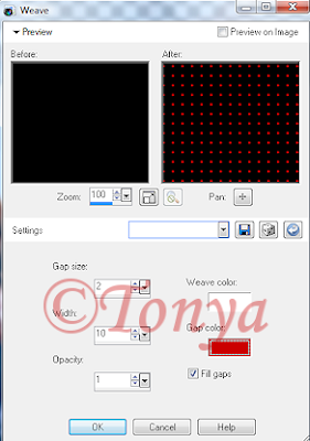
• On the Copy of Raster 4 layer, using your manual color correction tool, use #ffa6ff as the Source color and I used #cb0303 as the Target layer, click OK. On the Raster 8 layer, select all, float, and defloat, add a new layer and flood fill with the color black. Select none and delete the Raster 8 layer. Using the following settings apply Weave (Effects > Texture Effects > Weave):

• On Raster 7 layer, select all, float, defloat, add a new layer and flood fill with a gradient of the black and red. I always just use the foreground-background gradient and have the angel set at 45 and repeats of 2. Select none and delete the original Raster 7 layer. On the layer you just flood-filled, I applied Noise (Adjust > Add Noise) with setting of Uniform at 44% and monochrome checked.
• On Raster 5 layer, using your manual color correction tool again, change the Target from the red color we used previously to black. You shouldn't need to change the Source color at all. On Raster 3 layer, select all, float, defloat, add a new layer and flood fill with that gradient you made of the red and black colors. Delete the original Raster 3 layer. Back on that new layer you just created and flood filled, add a new layer, and open up the texture file in psp, copy and paste into selection in that new blank layer. Don't worry if the color looks hideously unmatched to your tag lol. Mine is pink right now. Change your blend mode on that layer to something you like. Mine ended up being Saturation (Legacy). It all depends on the colors of your tag and your texture which one you use. Select none.
• Paste your tube layer on top of the texture layer and move about, see mine for reference, I had one off to the left and then I mirrored it and moved to the right. Once you get how you want, merge the top one down (so that your 2 tube layers on the texture are in one layer. At this point, have your texture layer selected, select all, float, defloat, invert selections and contract your selections by 1 and press delete and select none. Now you may notice that some edges remain on the outer edge of the image canvas, don't worry about that I'll show you a tip later how to fix that. I changed the blend mode of the merged tube layer to Luminance (Legacy) and also moved the opacity down to about 40. This may vary depending on the tubes and colors you used.
• Raster 1 layer I did nothing with. Raster 2 I just used my manual color correction tool and changed that Target color back to the red color I used originally. It should turn the color very nicely to match the rest of the tag. On top of the Raster 2 layer, I added the tube again, I didn't really re-size from the original, play around with it, it may depend on the tube you use as to your re-size needs. On Raster 2 select all, float, and defloat, invert selections, contract selections by 1 and press delete. I know it looks a lil funky some of the tube in the frame yes? Leaving your selections as is, grab your eraser tool and carefully erase the parts outside of the heart. See my tag for reference. When done select none.
• On the white background layer, add a new layer and flood fill with the gradient and I applied mask 9 and then mask 4 on that layer. I did re-size by about 110% just to give a tiny bit more noticiable effect. Or you can use your raster deform tool if you prefer, just be careful you don't make too big so it cuts off on the edges. Once happy with your mask, merge layer group and all done with that yippee!
• At this point I re-sized my entire image to make it to what my ending tag will be. Add elements of choice from the kit, there is loads to choose from so just do what ya like! I pasted Raq's fab wordart piece as a new layer on top and re-sized to however fits good. I used once again my manual color correction and I actually left the Source and Target as is. I know the one color is a bit pinkish but the red seemed to turn out how I wanted so why mess with it I figured lol. Then I applied a Gradient Glow using Eye Candy 4000 to it. I just used a subtle one of a real light pink as my inner colors and the red I've been using in my tag as the outer. Play around with whatever setting you like best.
• Now I said we'd fix the stuff that hung over the sides didn't I? Look at the size of your tag in the bottom bar, my image is 598x536 however yours maybe be different of course. I re-size the canvas BIG. I usually do something like 1000x1000 just so I can see every possible bit that hangs over the edges. I know I know it looks weird but hey it works for me lol. Grab your selection tool, set on rectangle. On the tube layers you'll see what parts hang over, just select around them with the tool and press delete. I had to do that on 2 different layers. Once you have them corrected, go back to re-size your canvas again and plug in the original numbers you had (for me that was 598x536). Easy way to take care of any overhang of tube or drop shadow issues.
• Sharpen the tube layer and duplicate the tube, applying a gaussian blur of about 5 to the top tube layer. I then changed the blend mode to overlay. Use whatever your preference is on that, try a few out if you don't get the effect you want. On the original tube layer, I applied Xero Porcelain just to give her a nice healthy glow. At this point I applied a drop shadow using Eye Candy 5 Perspective Shadow. If you don't have this filter the drop shadow feature in PSP works just as fine! Add the artist's copyright information, including license number if you are using PTU art and of course your taggers watermark if you have one.
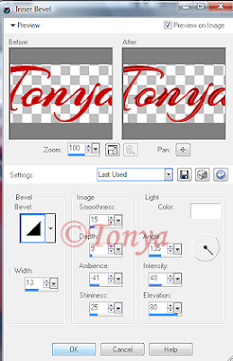
• Phew! Almost done, just gotta do your text now. I chose to use Arizonia font but if you do not have it any font works, all up to you. I used the same red I'd used in the whole tag and applied an inner bevel setting, use whichever one is your fave or this is the one I used:

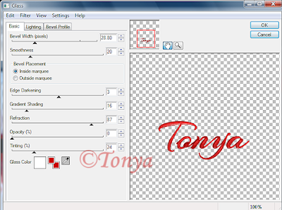
I then applied an Eye Candy 4000 Glass setting to shine up the effect a bit:

Followed of course by an Eye Candy 4000 Gradient Glow setting of choice. I just made mine black on the inner parts and red on the outer and of course a blurry red drop shadow.
• Well wow we are done finally! That was more detailed than I thought it would be but I hope you had fun and learned some fun tidbits along the way.
This tutorial was written by Tonya on September 7, 2010, absolutely no part of this tutorial may be taken or used without my express permission. Any part that may be similar to any tutorial is purely coincidental and unintended.
Labels:PTU Tutorials
Subscribe to:
Post Comments
(Atom)
Labels
- CDO (1346)
- Wallpapers (756)
- Timeline Set (395)
- CDO Bonus Tube (264)
- Dees'Sign Depot (231)
- Ladyhawwk Designs (226)
- Verymany (174)
- Tasha's Playground (138)
- Chichi Designz (135)
- CDO CT (130)
- Barbara Jensen (126)
- Foxys Designz (126)
- FTU Cluster Frames (120)
- Snag Sets (118)
- Hungry Hill (117)
- Honored Scraps (107)
- Rebel Dezigns (106)
- CDO Scrap CT (87)
- Gimptastic Scraps (82)
- Animated (72)
- Karmalized Scraps (72)
- Rebecca Sinz (62)
- Gothic Inspirations (56)
- Freebie (55)
- Chaos Priestess (54)
- CDO Scrapkit Bundles (52)
- Kissing Kate (46)
- Rieneke Designs (43)
- PTU Tutorials (42)
- Gradients (36)
- PTU Clusters (34)
- Zindy Nielsen (32)
- Templates (29)
- A Space Between (25)
- CDO Retired Bonus (25)
- Mystical Scraps (24)
- Creative Scraps by Crys (23)
- FTU Tutorials (22)
- CDO Collab Kits (20)
- Keith Garvey (20)
- Masks (20)
- Kizzed by Kelz (19)
- CDO Diamond Club (17)
- Forum Set (15)
- Scrappin' Krazy Designs (12)
- Doodle by Design (11)
- Schnegge Scraps (11)
- Special Note (11)
- AoRK (10)
- Birthstone Series (10)
- Monti's Scraps (10)
- Christmas (9)
- Treasured Scraps (9)
- No Scraps Tutorials (8)
- Whisprd Dreamz (8)
- Zlata M (8)
- CDO Scrap Collab (7)
- Digital Art Heaven (7)
- Pink Paradox Productions (7)
- CT Collabs (6)
- Dark Yarrow (6)
- Sophisticat Simone (6)
- TK Dezigns (6)
- Layouts (5)
- Textures (5)
- CDO Exclusive Tube (4)
- Creative Misfits (4)
- Irish Princess Designs (4)
- LML Designs (4)
- Curious Creative Dreams (3)
- Dance in the Rain (3)
- Freeks Creations (3)
- Raspberry Road (3)
- Awards (2)
- CDO Cluster Packs (2)
- Mellie's Beans (2)
- Scrapkits (2)
- Thank You! (2)
- Wicked Princess Scraps (2)
- sylly creationz (2)
- 'how to' tutorials (1)
- Blinkies (1)
- CDO Animation Collab (1)
- TOU (1)
Leave Some Lovin'
Search This Blog
Blog Archive
-
►
2020
(187)
- ► November 2020 (19)
- ► October 2020 (17)
- ► September 2020 (26)
- ► August 2020 (19)
- ► April 2020 (14)
- ► March 2020 (22)
- ► February 2020 (18)
- ► January 2020 (15)
-
►
2019
(178)
- ► December 2019 (17)
- ► November 2019 (20)
- ► October 2019 (10)
- ► September 2019 (15)
- ► August 2019 (8)
- ► April 2019 (18)
- ► March 2019 (16)
- ► February 2019 (13)
- ► January 2019 (18)
-
►
2018
(263)
- ► December 2018 (16)
- ► November 2018 (27)
- ► October 2018 (22)
- ► September 2018 (17)
- ► August 2018 (19)
- ► April 2018 (23)
- ► March 2018 (28)
- ► February 2018 (21)
- ► January 2018 (24)
-
►
2017
(253)
- ► December 2017 (11)
- ► November 2017 (16)
- ► October 2017 (23)
- ► September 2017 (15)
- ► August 2017 (22)
- ► April 2017 (28)
- ► March 2017 (21)
- ► February 2017 (33)
- ► January 2017 (25)
-
►
2016
(342)
- ► December 2016 (28)
- ► November 2016 (27)
- ► October 2016 (30)
- ► September 2016 (23)
- ► August 2016 (25)
- ► April 2016 (31)
- ► March 2016 (27)
- ► February 2016 (32)
- ► January 2016 (29)
-
►
2015
(362)
- ► December 2015 (35)
- ► November 2015 (43)
- ► October 2015 (29)
- ► September 2015 (27)
- ► August 2015 (34)
- ► April 2015 (31)
- ► March 2015 (31)
- ► February 2015 (22)
- ► January 2015 (25)
-
►
2014
(150)
- ► December 2014 (18)
- ► November 2014 (20)
- ► October 2014 (14)
- ► September 2014 (10)
- ► August 2014 (11)
- ► April 2014 (12)
- ► March 2014 (13)
- ► February 2014 (14)
- ► January 2014 (8)
-
►
2013
(37)
- ► December 2013 (3)
- ► November 2013 (6)
- ► October 2013 (3)
- ► September 2013 (2)
- ► August 2013 (4)
- ► April 2013 (1)
- ► February 2013 (2)
- ► January 2013 (4)
-
►
2012
(8)
- ► December 2012 (2)
- ► October 2012 (1)
- ► March 2012 (1)
- ► February 2012 (2)
- ► January 2012 (1)
-
►
2011
(20)
- ► December 2011 (4)
- ► November 2011 (2)
- ► April 2011 (1)
- ► March 2011 (3)
- ► February 2011 (2)
- ► January 2011 (3)
-
▼
2010
(42)
- ► November 2010 (1)
- ► October 2010 (1)
- ▼ September 2010 (5)
- ► August 2010 (2)
- ► April 2010 (3)
- ► March 2010 (4)
- ► February 2010 (5)
- ► January 2010 (16)
-
►
2009
(23)
- ► December 2009 (8)
- ► November 2009 (4)
- ► October 2009 (11)


0 comments:
Post a Comment